
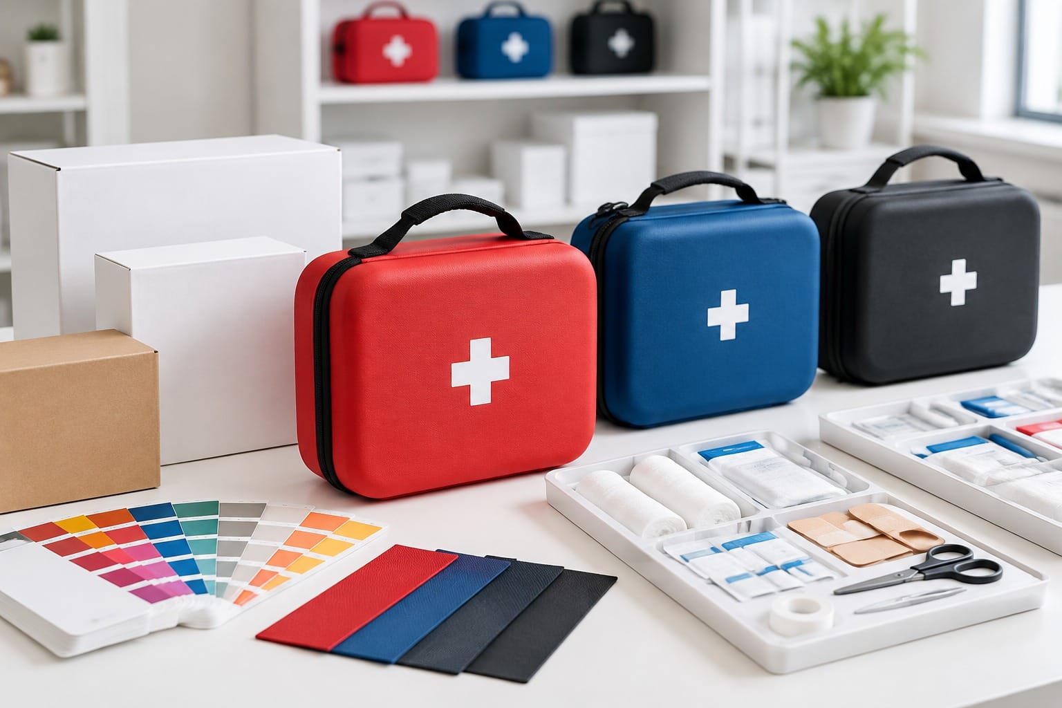
A buyer approves a red on a monitor. Six weeks later a pallet of first aid bags arrives in a red that reads a shade darker, and nobody can name the cause. Nothing failed. Four separate variables moved the colour, and none of them was a printer’s error.
Pantone colour matching packaging exists to close that gap. It replaces a screen value with a pre-mixed spot ink mixed to a fixed recipe, so the same shade can be reproduced by different presses in different countries. This guide covers the four decisions that decide whether a branded first aid bag holds its colour across a print run, a reorder and a second material.
What Pantone colour matching packaging fixes, and what it cannot
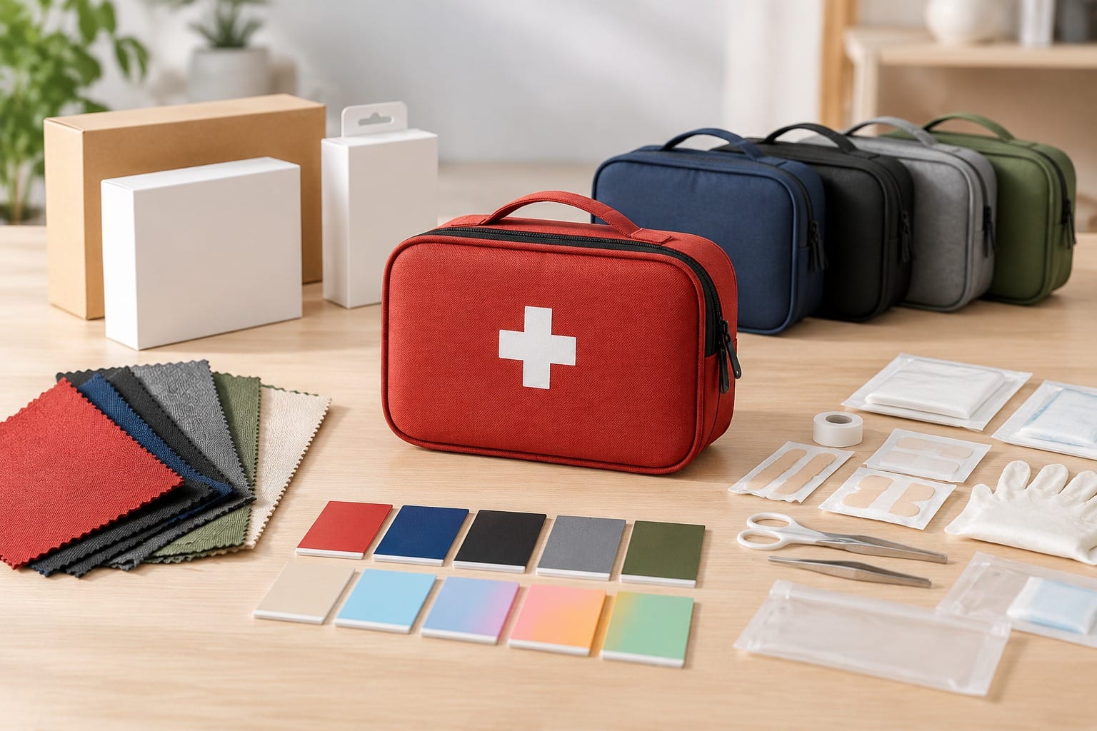
Process printing builds colour from four inks laid down as tiny dots. That is the right tool for a photograph of a folded bag. It is a poor tool for a flat brand panel, because dot gain and press variation shift a four-colour build from run to run.
A spot ink removes that variable. The ink is pre-mixed to a standard recipe, runs as its own unit on press, and reproduces as one solid hue rather than a dot pattern. For a logo, a signature colour band or a large solid area on a bag face, that difference is visible on a shelf.
What it does not fix is everything the ink lands on. A spot ink still sits on a substrate, still sits under a finish, and still gets judged against whatever reference the buyer named. Those three things are where most colour disputes are actually decided.
That is why a Pantone colour matching packaging brief is really a material brief. The ink is the fixed part. Everything the ink touches is the variable, and those variables are what the rest of this article works through.
| Variable | What it changes | Who decides it |
|---|---|---|
| Ink type | Whether colour is built from four dots or mixed as one | Buyer, at specification stage |
| Coated or uncoated reference | How the same ink number reads on a gloss or a matte stock | Buyer, with the printer |
| Substrate | Ink absorption, base tint and surface energy | Buyer and supplier, agreed before sampling |
| Finish | Perceived chroma under matte, gloss or soft-touch coating | Buyer, at proof stage |
| Tolerance | The point at which a shift becomes a rejection | Buyer, written into the order |
The practical consequence for a Pantone colour matching packaging brief is that one Pantone number is rarely enough. A bag programme that spans a printed carton, a woven label and a moulded buckle needs an approved value per material, not a single source of truth. Pantone’s own guidance on getting packaging colour right before it goes wrong makes the same point from the ink side: a colour designed without the intended material in view is a colour the supply chain has to reinterpret later.
Coated or uncoated: the suffix that changes the ink
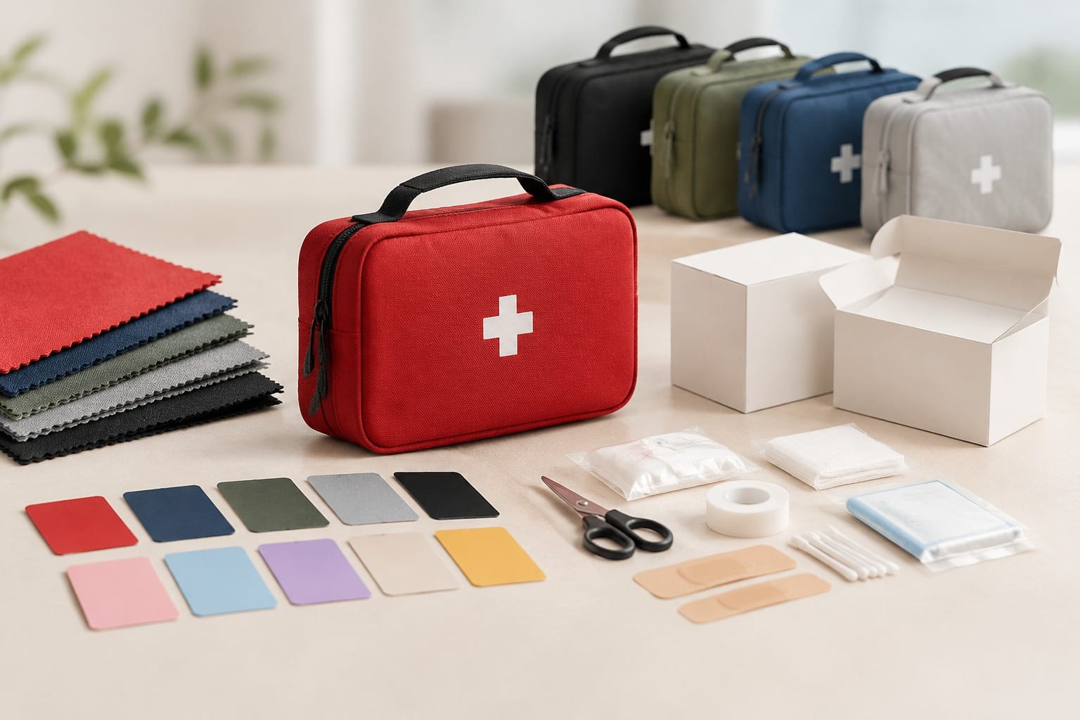
Pantone publishes separate values for coated and uncoated stock, written as a C or a U suffix. The same number on a glossy coated board and on an absorbent kraft stock will not read the same, because the paper surface changes how ink sits and how light reflects off it.
Buyers who omit the suffix hand the choice to whoever quotes the job. That is how two suppliers end up quoting the same number and delivering two different colours.
For first aid bags the suffix question usually splits into three cases:
- Laminated or coated bag panels — the reference is the coated value, and the laminate is then applied over it.
- Uncoated kraft or canvas-look panels — the reference is the uncoated value, and the panel will read softer and slightly greyer.
- Moulded plastic parts — the reference is a plastic standard, not a paper guide. Approving a plastic buckle from a paper swatch is a common and avoidable mistake.
The workflow that holds is specifying each reference against the material it will actually be printed on, not against the material the designer viewed it on. A buyer’s guide to Pantone matching on packaging sets out the same sequence: name the reference with the correct suffix, approve a drawdown on the real stock, then hold it across the run.
Read the suffix and the substrate together and Pantone colour matching packaging stops being a single instruction. It becomes two: which ink, and on what.
Substrate is part of the colour on a branded first aid bag
A bag programme is rarely one material. The same brand colour may appear on a printed carton, a film bag, a woven strap, a moulded buckle and a shipping carton. Each of those is a different surface with different ink behaviour.
Film makes the point sharply. Polyethylene and polypropylene are non-porous, so ink sits on the surface instead of soaking in. Raw film can repel it. Film therefore needs a surface preparation step, commonly a corona discharge, before ink and coatings will wet and bond properly. A specification that names a Pantone number but omits the film preparation step is incomplete. A technical breakdown of why the same Pantone reads differently per substrate covers the film case alongside board and corrugated, and it is worth reading before a material is fixed.
Two more substrate effects are worth writing down before sampling:
- Base tint. An opaque white underprint is often needed under a brand colour on kraft or dark board, and on clear film where the bag contents show through. Specify the white opacity alongside the brand value, or the colour will read light and uneven.
- Metallic and foil surfaces. Decide in writing whether show-through is intended. If it is not, the underprint has to be opaque enough to block it, and the approval has to happen on a wet proof rather than a PDF.
This is the part of a custom bag project where a supplier review helps most. UneedAid builds bags across a range of formats, from case-style supply boxes to soft emergency medical bags, and where a material cannot hold a target colour reliably, that is worth raising before tooling rather than after a print run. The fabric and hardware selection guide covers the material side in more detail.
The reason substrate belongs at the front of a Pantone colour matching packaging decision is cost. A material change after tooling or after a print run carries the tooling and the print again. A material change at specification stage carries nothing.
Writing a colour tolerance into the order
Colour is measured as Delta E, a number for how far two colours sit apart perceptually. A Delta E under 2 is generally treated as a strong match for a brand colour, while anything above 3 is usually visible to the unaided eye. Treating “match the Pantone number” as a complete instruction leaves that range undefined, and an undefined range is what turns into a dispute at goods-in.
A workable tolerance line in a purchase order names four things.
- The winning reference. A current physical guide, a signed drawdown, or an approved press proof. Name one, and say it beats the others.
- The viewing condition. Print approval is normally judged under a D50 or 5000K light source. An office fluorescent tube shifts the perception of both samples.
- The tolerance and its status. Whether the Delta E figure is a target, a warning band or a hard rejection threshold. Common programme targets sit in the 2.0 to 3.0 range, and tighter, around 1.5 to 2.0, where a logo is the element being judged.
- The fallback and the exception path. The approved process alternative when spot ink is unavailable, and who may sign off a visible shift when a substrate or press genuinely cannot reach the target.
Written that way, Pantone colour matching packaging becomes a measurable instruction rather than a preference. The order names what wins, what is tolerated and who decides when the target cannot be reached.
The measurement discipline matters as much as the number. Once a master swatch is archived with its date, stock, press and ink batch, the next reorder has something to be compared against rather than a memory. A working note on spot colour control lists the practical companions to a tolerance figure: a trap allowance of roughly 0.05 to 0.10 mm for register movement, an archived signed colour strip, and a re-proof whenever paper, film, ink batch or press changes.
The approval chain for a first aid bag print run
Colour approval works as a sequence, and each stage needs a named owner and a written output. Skipping a stage, or running two in parallel without a freeze point, is the usual root cause of a reprint charged to the buyer.
- Specification. Product, bag format, target market and the colour references per material, all in writing.
- Dieline or pattern issue. The supplier issues the cut and fold geometry for the bag panel in a vector file, with dimensions.
- Artwork layout. Buyer artwork applied on top of the approved geometry, with the printing method and any traps defined.
- Content and marking review. Any required text, barcode and coding area confirmed against the destination market’s requirement, which stays the buyer’s responsibility.
- Drawdown or wet proof. A proof produced on the actual material and approved under the agreed lighting.
- Pre-production sample. A sample from the real run settings, checked against the approved reference before the full quantity is released.
- Run release. The frozen revision named in writing, with the reference and tolerance carried into the production record.
Two stages carry more weight than they get. Stage two, because a pattern that does not match the cutting tool produces panels that fit badly. Stage five, because a proof approved on a screen is not evidence of anything the press will do.
UneedAid runs bag and print projects from a starting MOQ of 1,000 pieces with sample-based validation before production, so the proof and pre-production stages are where feasibility gets settled. The print method options guide and the artwork and prepress checklist cover those two stages in working detail, and the logo application methods guide covers the marking route once the colour is fixed.
Colour is the last thing to freeze and the first thing to be questioned. A Pantone colour matching packaging workflow that puts specification, proof and pre-production sample in that order gives a buyer three separate points to catch a shift, instead of one at goods-in.
FAQ
Why does my brand colour look different on screen and on the finished bag?
A screen emits light in RGB, which covers a wider range than any press can print. Most packaging colour is built in CMYK, a four-colour process that cannot reproduce some vivid shades. A bright colour that glows on a monitor can land muted in process printing. Pantone colour matching packaging replaces that build with a pre-mixed spot ink for the elements that must be exact, and the rest of the artwork stays in process colour.
Should I specify Pantone coated or uncoated for a first aid bag?
Specify the suffix that matches the material the ink actually lands on, not the one the designer viewed. A laminated or coated bag panel takes the coated reference. An absorbent kraft or canvas-look panel takes the uncoated reference and will read softer. For moulded parts such as buckles or closures, use a plastic standard and approve from a moulded sample or chip rather than a paper guide.
What colour tolerance should go into a first aid bag purchase order?
Name the winning reference, the viewing condition, the tolerance figure and its status, and the fallback. A Delta E under 2 is generally treated as a strong match for a brand colour, and above 3 is usually visible to the eye. Common programme targets sit between 2.0 and 3.0, with tighter values for a logo element. Saying which figure is a target and which is a rejection threshold is what prevents a dispute at goods-in.
Who is responsible for the required text and barcode on a branded bag?
That sits with the buyer and its advisers, because it depends on the destination market and on the retailer’s own system. The supplier’s job is to confirm what the printing equipment can reproduce, such as the coding area and the barcode size, and to print to the approved revision. Ask for the marking requirements in writing early, and confirm the clear zones the packing line actually needs before artwork is finalised.
Can one Pantone number cover every part of a bag project?
Usually no. A single bag programme can span a printed carton, a film bag, a woven strap and a moulded part, and each surface shifts the same ink differently. The workable approach is a short approved table with one value per material, plus a process alternative for cases where spot ink is not available. Building that table before sampling costs far less than rebuilding it after a print run.
How do I keep colour consistent across reorders months apart?
Freeze the specification, keep the master swatch, and require the same reference and tolerance on every order. Archiving a signed colour strip with its date, stock, press and ink batch gives the next run something concrete to match. Any change to the paper, film, ink batch or press then becomes a trigger for a fresh proof rather than an assumption that the colour will repeat.